
A photograph does not have to live only on a screen, in a frame, or inside a portfolio. When you begin treating your images as design elements, you can give them a second life in packaging, journals, client gifts, scrapbooks, mailers, and creative keepsakes.
That shift can be especially useful when you want your photography to feel more tangible. A small printed image can carry the same mood, color, and personality as a larger photograph, but it becomes something people can touch, place, and keep. The challenge is making sure the final result still feels polished and intentional.
Start With the Right Photograph
Not every image works equally well at a small size. A photograph that looks beautiful on a large monitor may lose its impact when reduced to only a few inches.
You will usually get the strongest result from images with a clear subject, simple composition, and enough contrast to remain readable at a glance.
Before preparing the file, zoom out until the image is close to its final printed size. Ask yourself whether the subject still reads immediately. If you have to study the image to understand what is happening, the composition may be too busy.
Prepare Your File for Print, Not Just for Screen
A file that looks sharp online is not automatically ready for printing. Screens can make lower-resolution images appear cleaner than they will on paper.
Adobe recommends 300 pixels per inch as a standard target for high-quality prints. That gives you a useful benchmark when sizing your artwork. A 4 x 6 inch print at 300 ppi, for example, needs an image of about 1,200 x 1,800 pixels.
Whenever possible, work from the original high-resolution file. Enlarging a small image does not recreate detail that was never captured. Resizing a strong original downward will generally give you more control than stretching a compressed copy.
Choose a Finish That Supports the Image
Paper finish changes the way a photograph feels. A matte surface can soften reflections and create a subtle, understated look. A shinier finish can make contrast feel stronger and colors appear more vivid.
If your design depends on saturated color, crisp highlights, or a polished commercial look, glossy sticker paper can be a strong choice. It can work particularly well with bright pet portraits, colorful product imagery, travel photographs, or graphic compositions that need visual punch.
The finish should support the mood rather than compete with it. A quiet black-and-white portrait may suit a softer surface, while a playful image with bold color can benefit from extra sheen.
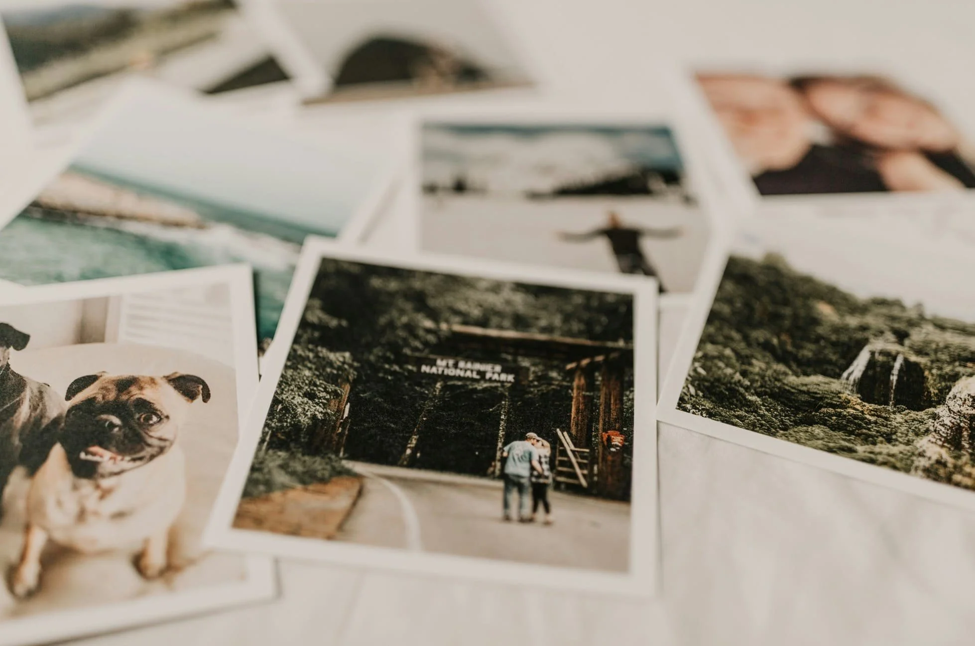
Photo by Sarandy Westfall
Pay Attention to Color Before You Print
Color is one of the biggest reasons a printed photograph can surprise you. Your monitor produces light, while paper reflects it, so the same image may appear slightly darker or less luminous once printed.
Before exporting, check your exposure, white balance, shadows, and saturation. Avoid pushing colors too far simply because they look good on a bright screen. If your printer or print provider offers a color profile, use it for soft proofing so you can preview possible shifts.
Build in Space for Cutting and Trimming
If your photograph or design extends to the edge, you need to account for bleed. Canva uses a default print bleed of 0.125 inches on each side for products that are trimmed, although your own printer may require something different.
That small margin matters because a slight cutting shift can leave an unwanted white edge. Keep faces, logos, text, and other important details safely inside the trim line.
A simple pre-print check can help:
Keep the main subject away from the edge.
Add bleed when the background runs to the cut line.
Leave comfortable spacing around text.
Print one test sheet before producing a larger batch.
Think About Where the Image Will Be Used
The final use should guide your design choices from the beginning.
If you are creating pieces for client packaging, you may want a clean portrait, a logo, or an image that reinforces your visual brand. For personal keepsakes, you can be more playful by combining photographs with dates, names, handwritten notes, or short captions.
For photographers, small printed pieces can also extend the experience of a session. A thoughtfully printed image added to a thank-you card or package can make delivery feel more considered. You are not simply handing over digital files. You are creating a physical reminder of the story behind them.
Protect the Details That Make the Photograph Yours
When you reduce an image, some details naturally become less visible. That makes editing restraint even more important.
You do not need to sharpen every edge or increase contrast dramatically. Focus instead on the features that give the photograph its character. In a pet portrait, that might be the eyes, fur texture, or expression. In product photography, it may be surface detail and accurate color. In a family image, the emotional connection matters more than tiny background elements.
Your goal is to preserve the feeling of the photograph, not just its technical perfection.
Let the Printed Piece Continue the Story
Photography becomes more memorable when it moves beyond the expected format. A small printed image can turn a package, notebook, gift, or personal project into something that feels thoughtful and specific.
When you choose the right photograph, prepare it at a suitable resolution, manage color carefully, and plan for trimming, you give your work a better chance of looking as strong in print as it does on screen.
The most successful result is not simply a sharp image. It is a printed piece that still feels like your photography: intentional, expressive, and connected to a story worth keeping.